
Viacom / Video
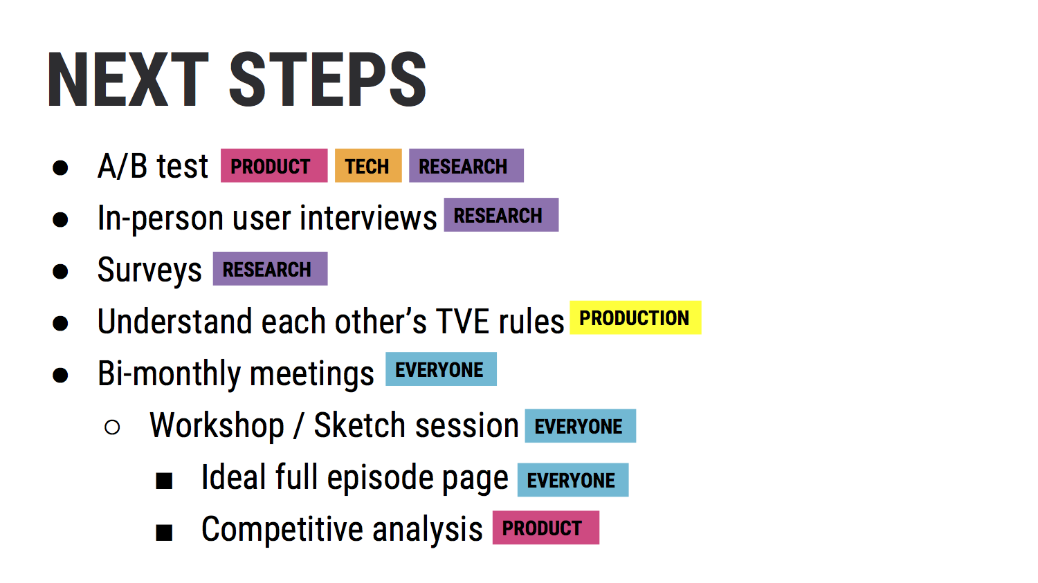
User Research
Wireframes
Prototyping
Usability Testing
Stakeholder Meetings
Analytics
A/B Testing
Machine Learning
Viacom set out to unify the video experience across MTV, Comedy Central, VH1, Spike, and Logo with a single responsive player — reducing maintenance overhead and streamlining updates across brands. But video views were the company’s core revenue driver. Any change to the player carried real financial risk. If it didn’t perform, it could cost millions.
What looked like a layout update was anything but simple. Months of research, testing, and cross-functional alignment led to a solution that earned buy-in from 30+ stakeholders across five brands. This page represented the primary entry point for the majority of our users, so every decision had to be intentional, validated, and defensible.
And beyond maintaining performance, we saw an opportunity: redesign the experience in a way that didn’t just preserve views — but increased them.

OVERVIEW
Role: Lead Product Designer
Timeline: 1 year
Team: Cross-brand stakeholders (~30+), 9 engineers, 3 analytics, 1 junior designer, 1 design director, 1 VP of design
Scope: Video player for web
PROBLEM
At first glance, the legacy pages looked nearly identical. In reality, each channel operated within its own set of rules — unique metadata structures, varying character limits, distinct typography systems, and different color palettes. It was these minute details that could make or break the buy-in for the redesign and, ultimately, the change itself.
Beyond that, we were also seeing:
60% drop-off from non-logged-in users
85% of users watched only one video per session
While we were initially mandated to simply create a single, consistent page template, the scale of the effort presented an opportunity to think bigger. With such a large lift already happening we decided to capitalize on the momentum and address deeper engagement challenges.
After evaluating the experience holistically, it became clear that increasing video views wouldn’t come from visual design changes alone — it would come from rethinking the recommendation logic powering what users saw next.


PROCESS
It was a multi-step undertaking to get to what you see above.
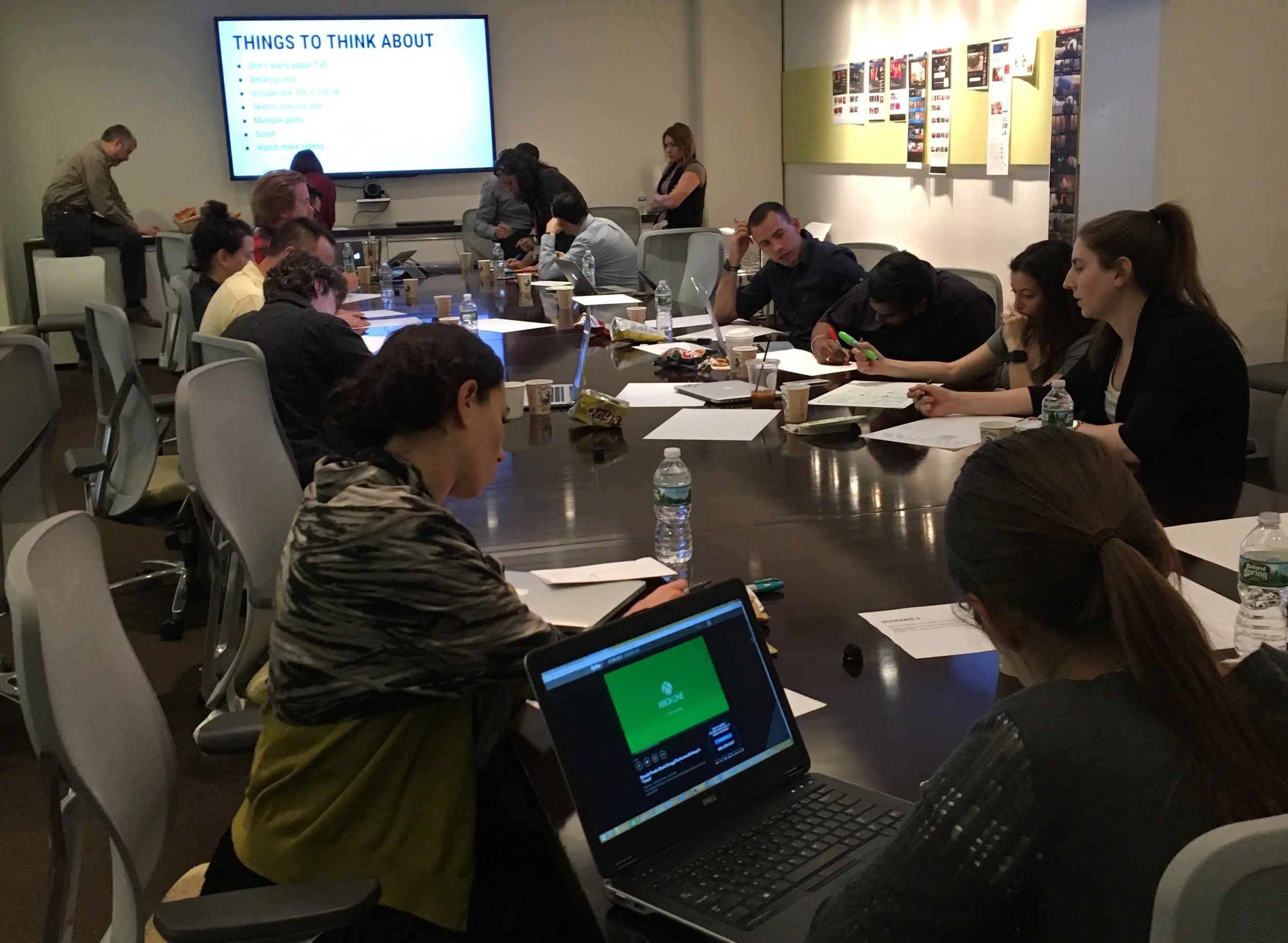
The first step was to get an understanding of what we were dealing with internally: tech constraints, types of shows across all the brands, specific pages that would be involved, SEO impact, current analytics, brand needs, ad requirements, legal requirements, etc. While getting a lay of the land, we also talked to users about their video consumption habits. We came up with a number of assumptions, but before any of them came to play, we had to test.
Each state of the page was meticulously thought out:
if the user was watching a clip vs an episode,
if the user was signed in with their TV provider or not,
if the video had explicit content,
if it was exclusive footage,
if it was an old sneak peak and the following episode was already available,
the list goes on.
Some steps taken to get to the final product:
Competitive Analysis

Data Analysis

Bi-Weekly
Stakeholder Meetings


Workshops
A/B Testing


Usability Testing

CONCLUSION
The first brand received the new redesign in December 2016. After ensuring that we had in fact increased video views and had not negatively impacted our users (we checked our unfiltered feedback on Twitter and Qualtrics regularly), we rolled out to the other brands in stages. By February 2017, all five brands had the new layout.
The main changes that had a direct impact on our users and the company were:
TVE — We made it easier and quicker for users to find their TV provider and log in. We also provided 24 hour access to those who did not have a cable subscription.
Up Next Logic — We changed the logic for what videos appear after the user’s initial selection. This logic varies depending on the type of video and type of show the user is watching. We tested our logic against varying machine learning algorithms from third-party vendors, but my original logic still proved the most successful.
Ad Placement — With the new redesign, we were able to keep an ad in constant view which, of course, increased revenue.
Since this project was a success, other pages were getting similar treatment. When I left Viacom, the plan was to rollout to other brands both domestically and internationally.