Disney+ / Home Screen
User Research
Analytics
Wireframes
Prototyping
Usability Testing
Stakeholder Meetings
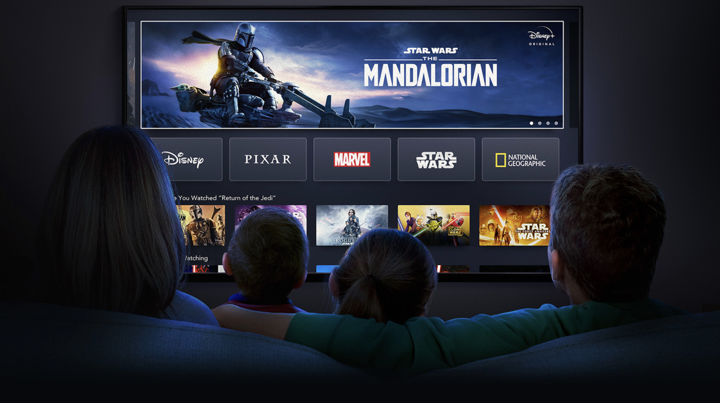
When most people think of Disney, a handful of iconic titles come to mind — Frozen, The Little Mermaid, Mickey Mouse. Maybe Star Wars or Marvel for the superfans.
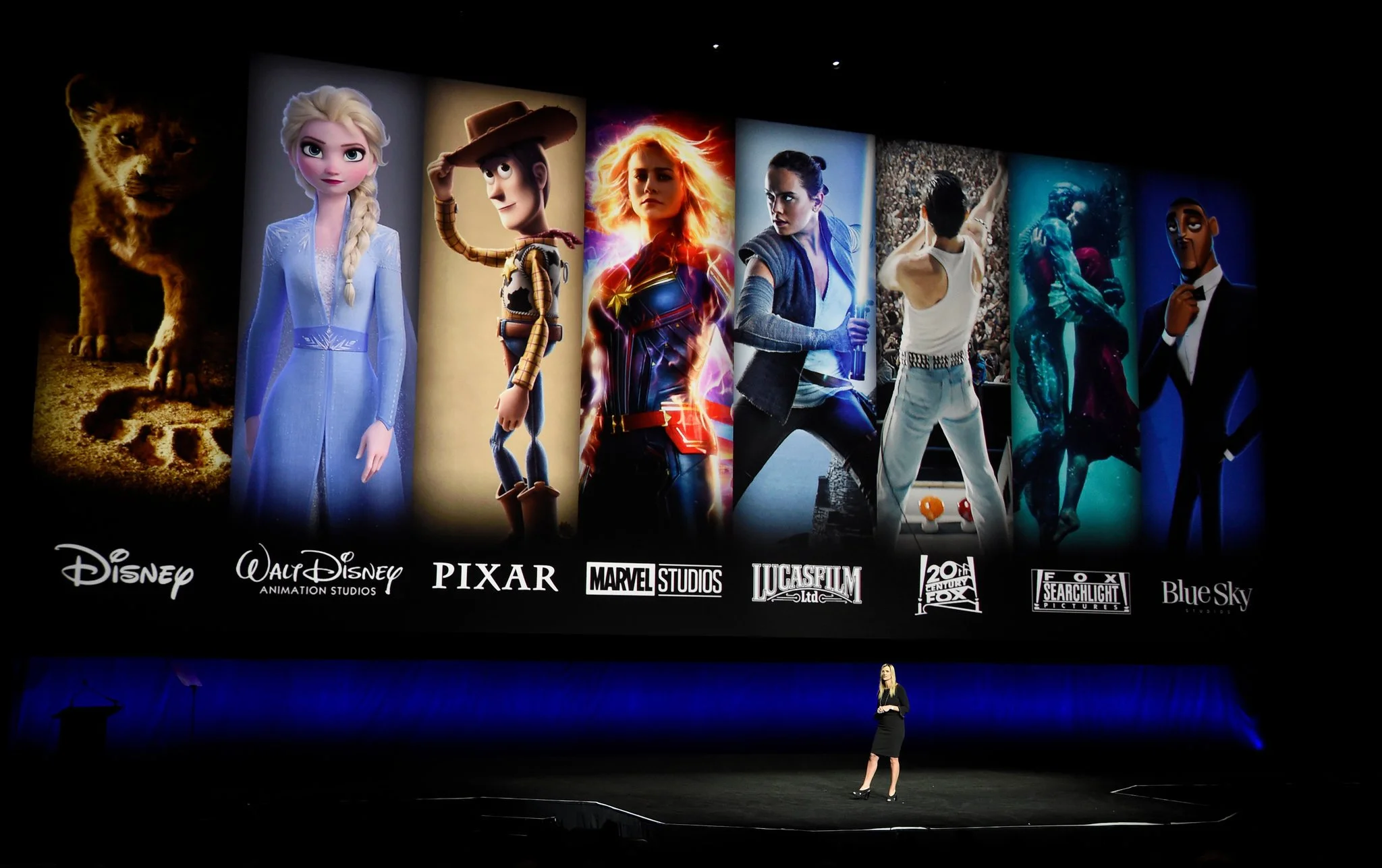
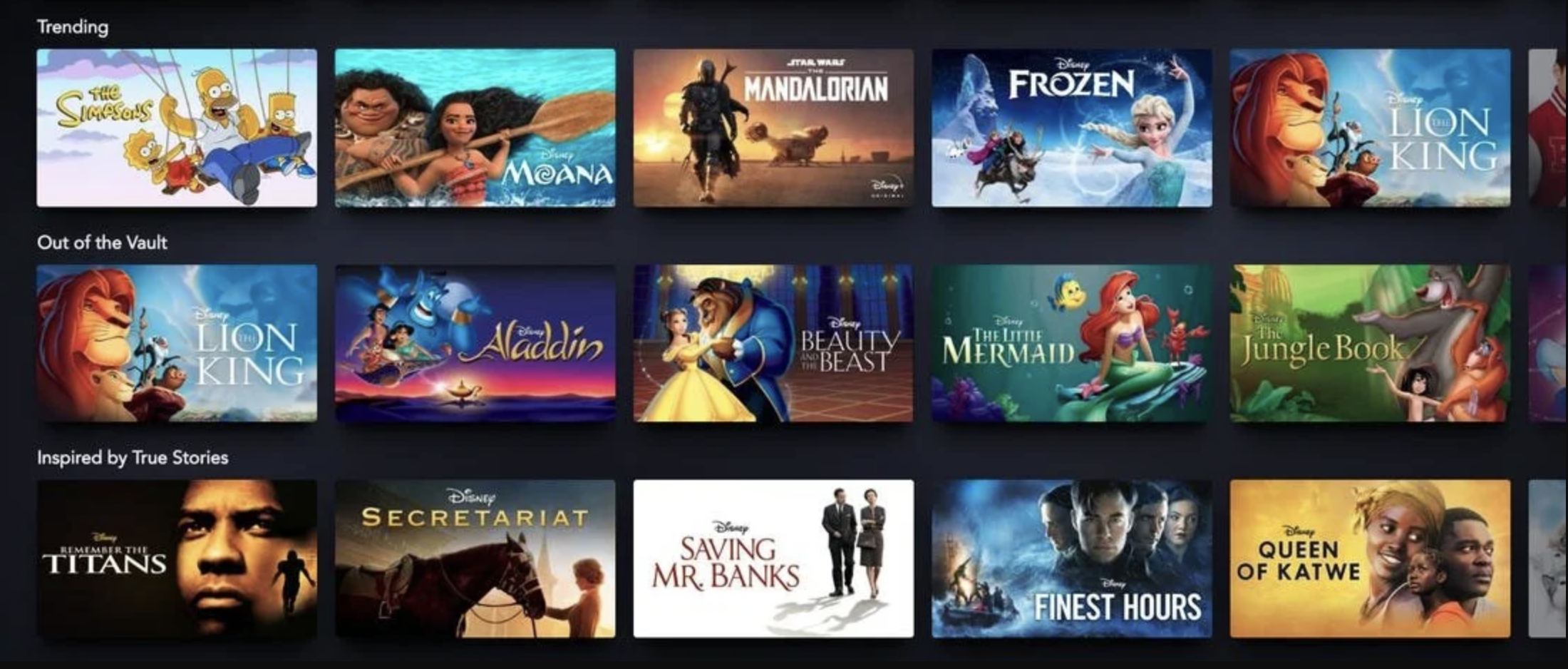
That brand recognition is powerful — but it was also a challenge. Disney+ wasn’t just a home for a few beloved franchises; it housed an expansive, multi-brand ecosystem of content. The problem wasn’t awareness of Disney. It was helping audiences understand the true breadth and depth of what Disney+ actually offered.
OVERVIEW
Role: Lead Product Designer
Timeline: 1 month
Team: 1 Product Manager, 3 Product Designers, 1 Data Analyst, 1 UX Researcher
Scope: Home screen
THE BUSINESS PROBLEM
Disney+ had no issues with getting subscribers, but:
~50% of failed sessions occurred only on the home screen
63% of TV users weren’t seeing past the fourth row of content
72% of users who unsubscribed cited there wasn’t enough content
Less than 20% of available content was being watched
The creation and release of new content was limited, but people weren’t exploring what was already there beyond what they had assumed. We needed to increase video views while also reducing churn.
Leadership initially asked for “more titles in the home screen carousel.”
But after reviewing product data, I reframed the problem: How do we show users more value without trying to change their current habits?
PROCESS
We reviewed exit data, CTRs, and user interactions, then challenged assumptions about how users perceive catalog breadth. We found that TV users often stopped scrolling after a few rows because the layout didn’t invite exploration.
Users weren’t exploring the catalog because the UI suggested less content existed than actually did, limiting engagement, and increasing churn.
We then focused on these key areas:
Encourage exploration
Surface content in ways that naturally reward continued scrolling.Break the browsing monotony
Introduce moments of visual change that keep the interface from feeling repetitive.Prioritize high-impact areas
Focus attention on the first few rows where most browsing decisions happen.Maintain familiar behaviors
Introduce new discovery patterns without requiring users to change how they browse.
And that last point was key. If the interface subtly encouraged exploration—through scroll behavior and smarter content surfacing—users could perceive greater value and engage more deeply with only small behavioral nudges.
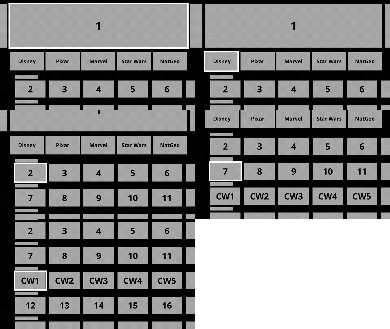
Fixed Focus
Original Disney+ row scroll behavior
By the time a user reached the end of a row, they would have only been exposed to 5.5 tiles.
Proposed Disney+ row scroll behavior
By the time a user reached the 5th tile, they would have been exposed to 9.5 tiles.
Vertical Scroll
Original Disney+ vertical scroll behavior
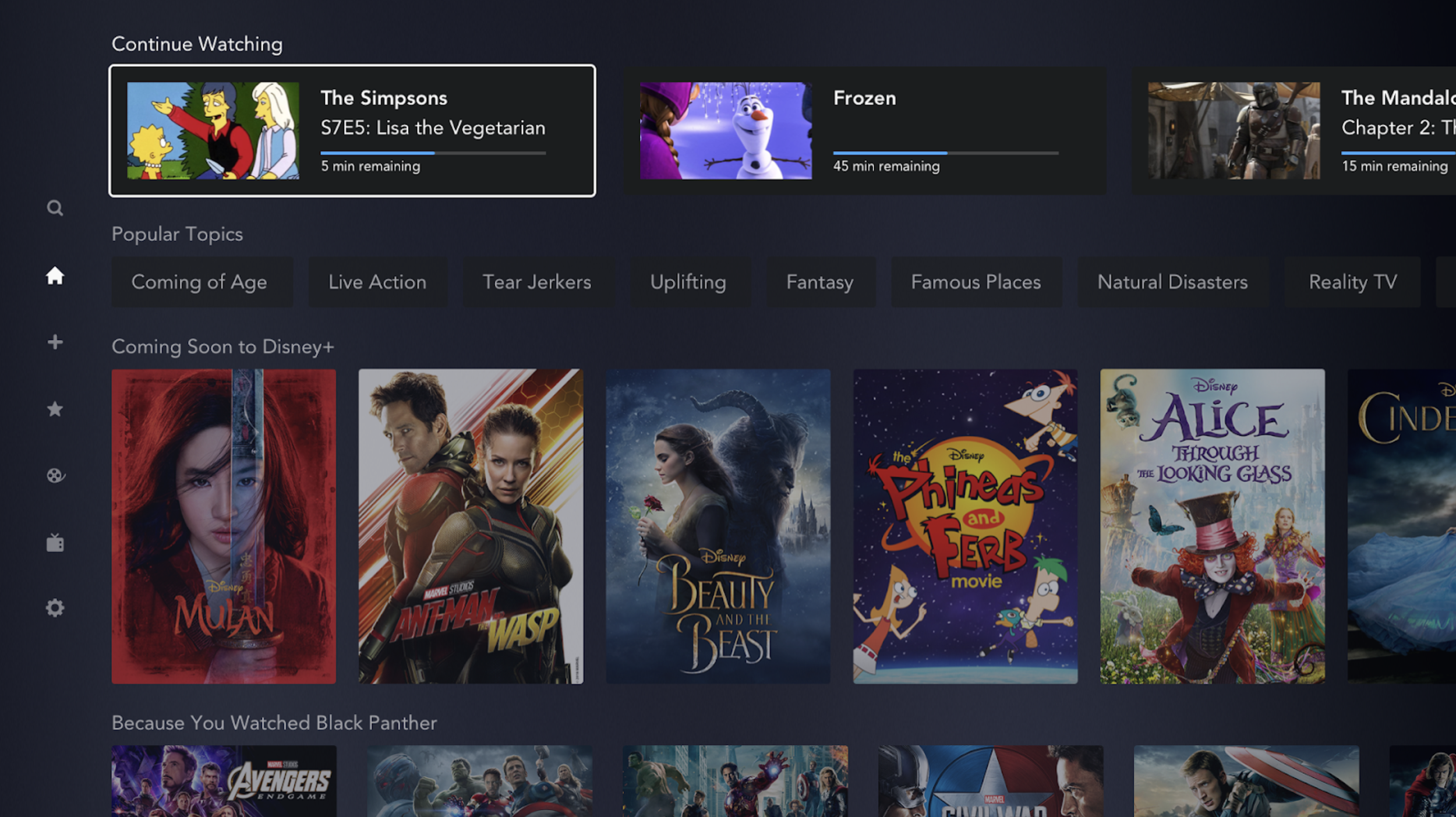
By the time a user reached the Continue Watching row, they would have only been exposed to 16 tiles.
Proposed Disney+ vertical scroll behavior
Instead of the standard row nudge, the interaction introduced a structural shift in the vertical scroll pattern, moving the entire interface upward. This exposes a user to 26 titles by the time they reached the Continue Watching row.
CONCLUSION
The project was cut short by a larger business initiative. Disney+ had decided to create a new app for its South American audience which would house mature content (PG-13 and above) as well as live sports, Star+.
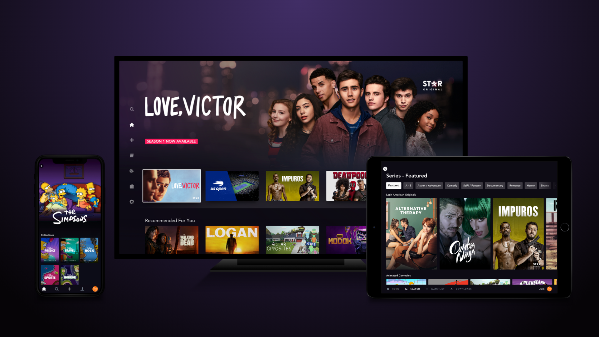
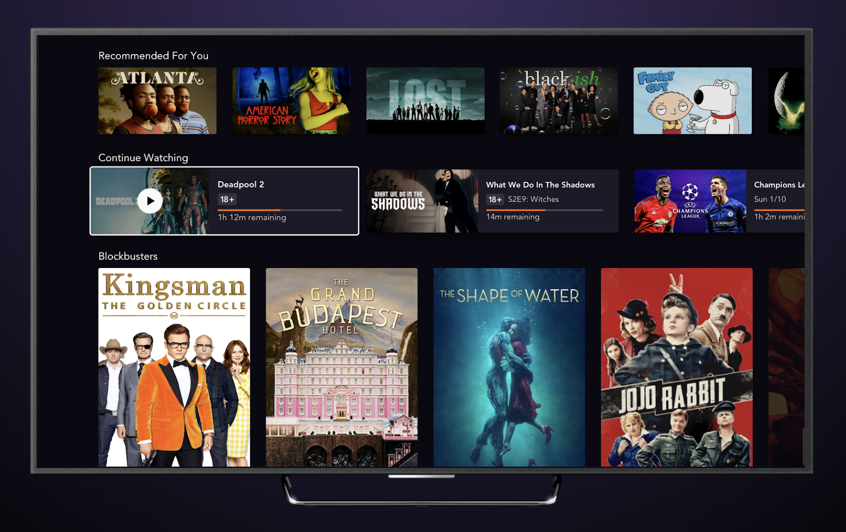
Three of my concepts — the home screen layout, continue watching tiles, and genre tabs — shipped directly in Star+.
Star+ launched to millions of subscribers across 11 countries in August 2021.
The full interaction model lives behind an NDA — I'm happy to walk through it end-to-end in a conversation.
