Viacom // DesignOps
User Research
Stakeholder Meetings
Product Management
Visual Design
Viacom had an internal merger and suddenly the product design team expanded and went from being responsible for 5 brands’ websites and apps to over 180 websites and apps across the world. Overnight, the systems we had in play were no longer sufficient. Our workflows were not scalable to that degree.
I presented these challenges with possible solutions to the VP of Product Design. We carved out a role for me as the UX Lead for DesignOps on the team. I worked with the rest of the team to create better communication, a design system that would become the building blocks for all the brands across all platforms, and, last but not least, improve morale after the merger.
DETAILS
Prior to this merger, Viacom had multiple teams working on all its products. Products that were on different platforms, had different requirements, supported specific brands, etc. However, even domestically things were inconsistent. For a multitude of reasons, we just weren’t working as efficiently as possible. And given the speed at which we had to produce new features for events, new shows, or sponsors, it was sufficient. But this was no longer going to be the case given our new breadth of work.
The biggest challenges I wanted to address and tackle in my new role were:
Our squads were duplicating each other’s work — researching similar things, creating similar modules. The research and the features weren’t being disseminated widely enough and we were creating tech debt.
Design was inconsistent across brands, platforms (web vs app vs tvOS), and sections (shows, events, news). Our users had to re-learn if they jumped between these different areas.
When a merger happens, companies often forget to address morale. Suddenly, people you had been working with for ages are replaced by strangers. There’s a lack of understanding and trust. The dynamic changes and employees begin to wonder if the company has their best interest at heart and how they can grow from here.
Here are some of the ways I addressed these challenges:
Team Hubs
I created Confluence and JIRA hubs for our team. The Confluence hub provided onboarding documentation, information about all brand requirements, all necessary logos and fonts, links to all ongoing and past research projects, etc. The JIRA hub was a board that tied together all design tickets across multiple scrum teams. It was not only searchable by designer, but also by brand and feature. These hubs allowed anyone to go in and see the work that was being done and what stage it was in whenever they wanted rather than wait for a team meeting or for it to be brought up.
Design System
We started with multiple sketch sessions to figure out ways to tackle building our Design System. I worked with a Design Director to split up parts so that designers had to work in pairs to create and present to the rest of the design team as well as our product managers and developers. Designers then took the Design System to recreate existing pages to determine changes and compatibility.
Team Activities
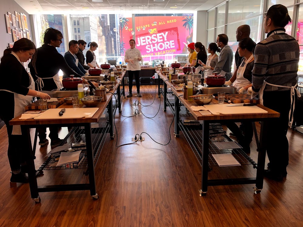
I implemented quarterly anonymous surveys that asked designers how challenged they were feeling, how effective meetings were, what skills they wanted to improve upon, and what topics they wanted to hear more about. We addressed the results and used the suggestions to improve our team meetings and process. I also arranged team bonding events such as the cooking class seen above.
CONCLUSION
By the time I left Viacom to pursue the Blue Ridge Labs fellowship, the design system had been implemented on one brand. Since then, multiple brands have been updated with more coming soon.


